From boring to exciting:
learn new words daily
Part II - UI Side
Moving into the UI Phase
This vocabulary learning app is specially designed for Sri Lankan students studying in France. They’ve been using 2–3 different apps for their learning journey — switching between platforms for vocabulary, pronunciation, and practice. With this new app, we aim to bring everything together in one place, and introduce new features to make the experience more complete and engaging.
Now that the UX part is complete, let’s look at how I handled the UI side — from defining the style to crafting high-fidelity screens.
UI Moodboarding / Inspiration Gathering
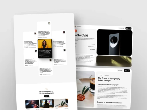
Before jumping into UI design, I explored how similar apps were solving the same problems. Studying real examples helped me understand:
What’s already working well
Where users still experience gaps
How I could approach things differently (or better)
These references inspired new ideas, helped me avoid common mistakes, and gave me a clearer design direction. Here are a few UI use cases I found inspiring:

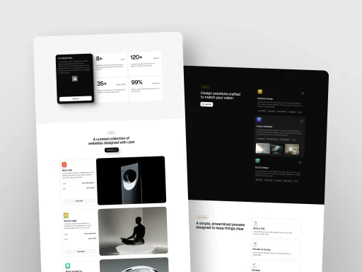
Design System / Style Guide Creation
To ensure consistency across the entire app, I created a simple yet flexible design system. This included a core set of reusable styles and components that made designing and development faster and more aligned.
The style guide covered:
✅ Typography — Clear, readable font choices for headings and body text
🎨 Color Palette — Friendly, accessible colors chosen to reflect learning and simplicity
🧩 UI Elements — Buttons, input fields, cards, icons, and error states
📐 Spacing Rules — Consistent padding, margins, and layout grids
By defining these foundations early, I was able to keep the UI clean, unified, and easy to scale — even when adding more features later.
Based on these explorations, I created fully usable components and developed a style guide. The client appreciated the cleanliness and simplicity of the style guide, which made the design system easy to understand and apply.

Let’s Build the UI
Building on the defined typography, button spacing, color palette, and grid system, I began designing the UI screens. Each decision was guided by the UX strategies we had established — ensuring clarity, usability, and a smooth flow throughout the product.
I kept the interface clean and focused, balancing visual appeal with functionality. Every screen was carefully designed to address the real needs of our student users.

From research to wireframes and finally to polished UI — you’ve just walked through the UX and UI journey of this project 💡💻.
Thank you for exploring it with me! I hope you enjoyed the process as much as I enjoyed creating it.
✨ See you in the next project! ✨