From outdated to outstanding: A fresh ad-tech redesign.

Introduction
This project was about giving an ad-tech company’s outdated website a fresh, modern face. The old site felt cluttered and lacked interactivity, making it hard to engage users. My goal was to redesign it with a focus on simplicity, clarity, and meaningful interaction.
To kick things off, I had a detailed discussion with the Product Owner. We explored key questions around the existing site: What wasn’t working well? What business goals needed more visibility? What new ideas could elevate the experience? Through this conversation, he shared expectations, feature requirements, and a few fresh concepts for the redesign.
With that clear vision, I began by reorganizing the content and planning the Information Architecture (IA). This step created a strong foundation, ensuring the new site would be structured in a way that felt both user-friendly and true to the brand’s objectives.

Wireframes
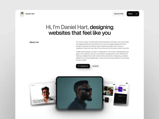
Building on the defined typography, button spacing, color palette, and grid system, I began designing the UI screens. Each decision was guided by the UX strategies we had established — ensuring clarity, usability, and a smooth flow throughout the product.
I kept the interface clean and focused, balancing visual appeal with functionality. Every screen was carefully designed to address the real needs of our student users.

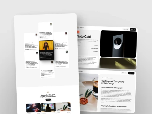
Home page
After finalizing the Information Architecture, I shared it with the Product Owner for feedback. Based on our discussions, I moved forward with creating rough wireframes to visualize the layout and flow.
I explored 2–3 different versions to test out ideas and improve the structure. Through collaborative feedback rounds, we refined the designs and eventually finalized a wireframe that aligned perfectly with the project’s vision and user goals.

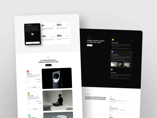
After completing the UI designs, the Product Owner was genuinely happy with the results. I was able to meet all of his requirements through a simple, clean, and user-friendly design approach.
According to initial web analytics, the redesign also showed promising improvements — helping the site become more engaging and clickable, encouraging users to interact more with the content and features.
✨ Thank you for taking the time to explore this project!
See you in the next use case with more design stories and creative solutions. 🙌🎨